In this article we will learn how to visualize a dataset using Python Seaborn library, specifically focussing on the Wheat Production and Supply dataset released by USDA every month. You can download the latest data from below location: Download the Wheat Data-All Years as highlighted in red below.
https://www.ers.usda.gov/data-products/wheat-data/
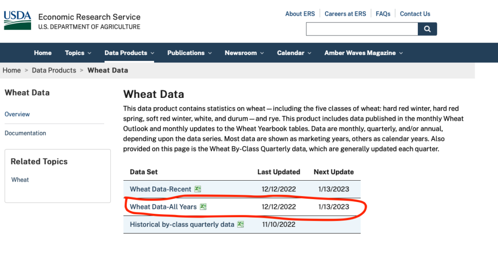
You will get a file named – Wheat Data-All Years.xlsx in your downloads folder.
Understanding the Dataset
This dataset contains statistics on wheat—including the five classes of wheat: hard red winter, hard red spring, soft red winter, white, and durum—and rye.
The first sheet of excel contains the contents of the whole excel book. Below is the screenshot of the contents.
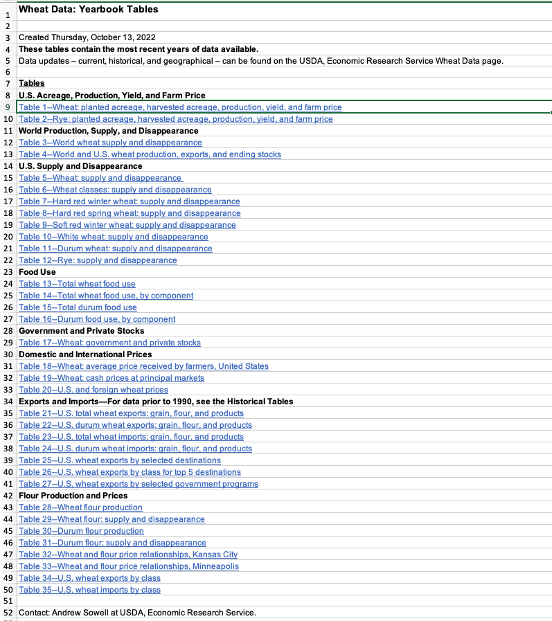
In this article we will focus only on analyzing the first sheet in this excel which is the Table 1 – Wheat: planted acreage, harvested acreage, production, yield and farm price data series(sheet name WheatYearbookTable01-Full).
Preprocessing the data
To make it easier to process data in Python, we will first do some manual cleanup for the first sheet in the excel file. Open this file in MS Excel and go to the first datasheet(WheatYearbookTable01-Full).
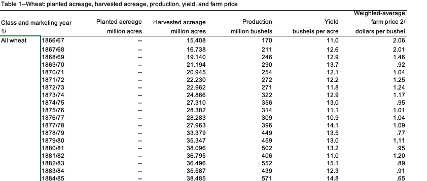
Column A contains a merged column for the wheat type. In this preprocessing step, we will manually unmerge it and copy the values in all the rows belonging to that wheat type. You can even do that in Python but I found it much easier to do it in excel itself (save time whenever you can).
Before
After
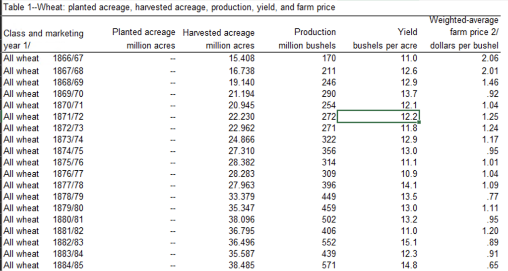
As you can see above now column A has wheat type populated for each row individually. Similarly you can also clean up the double dashes “–” from the columns as it will help in reading the data in correct data typed format. But for this case I will show how to clean it up using Python.
Now let’s read this file in jupyter notebook.
Reading dataset in Jupyter Notebook
In order to read this data using Pandas read_excel function you will need to install a depdendent library called openpyxl. You can do that by running pip install openpyxl in your python environment where you run your Jupyter notebook
Now with that installed we are all set to fire up our jupyter notebook and start digging into this dataset
First step is to import dependencies and setting the display options for max columns and max rows for pandas. Don’t worry! complete Jupyter notebook is available on Github here.
import pandas as pd
import numpy as np
import matplotlib.pyplot as plt
import seaborn as sns

pd.set_option('display.max_columns',500)
pd.set_option('display.max_rows',1000)
As you can see we are using pandas to read and manipulate data and matplotlib and seaborn for visualization. Now we are all set to read the first sheet in the excel into a pandas dataframe
wheat_raw_df = pd.read_excel('Wheat Data-All Years_Dec2022.xlsx',sheet_name ='WheatYearbookTable01-Full',skiprows=1,skipfooter=11)
print(wheat_raw_df.shape)

(691, 7)
Here I am skipping first row and last 11 rows, in order to read only the data table and ignore any other text rows in the excel sheet. After reading this file if you are reading (Dec 2022) data like me you will see a shape of 691 rows and 7 columns
Data Cleanup
Now that we have the dataset in a pandas dataframe (wheat_raw_df) we will need to cleanup a few things before we can start visualizing the dataset.
1. Rename the columns to analysis friendly names
The original dataset contains spaces and special symbols in the column names, here we will just assing a new name to each column
columns=['WheatType','MarketingYear','PlantedAcreage','HarvestedAcreage','Production','Yield','WAVFarmPrice']
wheat_raw_df.columns = columns
wheat_raw_df.head()

As you can see above all the columns have now been renamed. And so that we do not loose the units information I have created a dictionary to store units information for each column as shown below
units = {'PlantedAcreage':'million acres',
         'HarvestedAcreage':'million acres',
         'Production': 'million bushels',
         'Yield':'bushels per acre',
         'WAVFarmPrice':'dollars per bushel'
        }
2. Remove the very first row from the dataframe
In the above screenshot the very first row just contains the units for each columns, now that we have captured units into a separate dictionary object we can simply drop this row to further clean the data
wheat_raw_df = wheat_raw_df.drop(index=0,axis=0)
Here is how the first few rows of the cleaned dataframe looks like

We still see some dashes “–” but we will clean them up as we go along visualizing each column.
Now lets begin with our first visualization
Average Farm Price Visualization
Let’s see how the Average Farm Price has varied historically.
We will now create a line chart for WAVFarmPrice field for wheatType = ‘All wheat’. But before that we will need to remove the dashes from the WAVFarmPrice column using below statement
wheat_raw_df['WAVFarmPrice'] = wheat_raw_df['WAVFarmPrice'].apply(lambda x: np.nan if str(x) == '--' else x).round(2)
Now lets see the plot
wheat_raw_df[wheat_raw_df['WheatType']=='All wheat'].plot(x='MarketingYear',y='WAVFarmPrice');
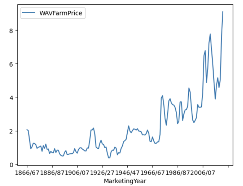
This plot is created using the matplotlib library. We will also see some seaborn examples later on. But this graph shows how the wheat prices have varied from year 1866 onwards in US. The prices have varied from $2 (in marketing year 1866/67) to approx. $10 (in marketing year 2022/23)
Now lets visualize more recent years starting from year 2000 for all types of wheat in this dataset namely
- Hard red winter
- Hard red spring
- Soft red winter
- White
- Durum
wheat_raw_df = wheat_raw_df.dropna()
wheat_raw_df['Year'] = wheat_raw_df['MarketingYear'].apply(lambda x: int(x.split('/')[0]))

for wheatType in wheat_raw_df['WheatType'].dropna().unique():
    print(wheatType)
    sns.set(rc={'figure.figsize':(25,8.27)})
    all_wheat_df = wheat_raw_df[(wheat_raw_df['WheatType']==wheatType) & (wheat_raw_df['Year']>2000)]
    gpg = sns.lineplot(data=all_wheat_df, x='MarketingYear',y='WAVFarmPrice',label=wheatType);
    gpg.legend(fontsize=20)
    plt.xticks(rotation=90);
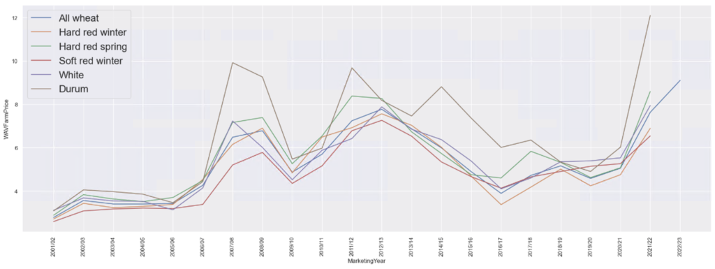
In the above code snippet we have used seaborn to produce the chart comparing all wheat type prices. We also needed to split the marketing year column so that we can filter on the year easily.
As we can see in the above chart, Durum wheat has always commanded better prices than other varieties of wheat. It is an exercise for the reader to figure out why!
Now lets visualize the production quantity
Wheat Production Visualization
Wheat production is measured in million bushels. 1 bushel of wheat is approx 27 KGs. Lets see how the production data looks like after year 2000.
for wheatType in wheat_raw_df['WheatType'].dropna().unique():
    print(wheatType)
    sns.set(rc={'figure.figsize':(25,8.27)})
    all_wheat_df = wheat_raw_df[(wheat_raw_df['WheatType']==wheatType) & (wheat_raw_df['Year']>2000)]
    gpg = sns.lineplot(data=all_wheat_df, x='MarketingYear',y='Production',label=wheatType);
    gpg.legend(fontsize=20)
    plt.xticks(rotation=90);
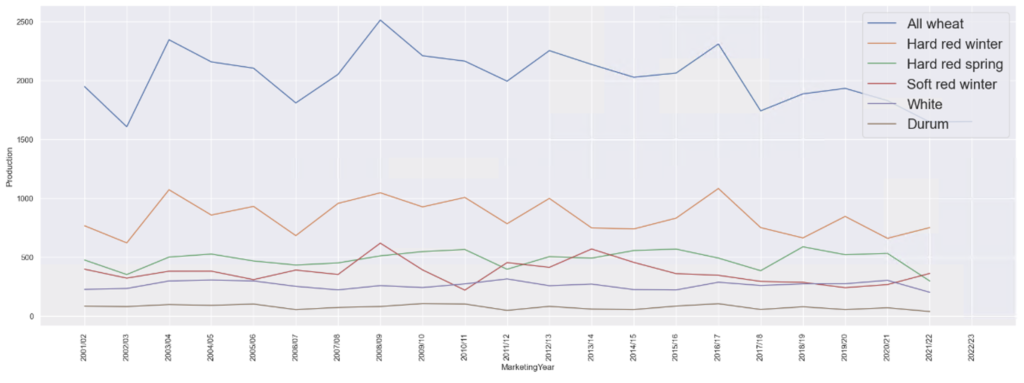
As you can see most produced wheat variety is the Hard red winter and durum is the least, may be thats why Durum is expensive as its supply is low. Upon research I found Durum is used in making Pastas. So Italian people might not be happy about the rising prices of Durum wheat.
Harvested Area Visualization
Similarly for Harvested Acreage the plot looks like below post marketing year 2000
wheat_raw_df['HarvestedAcreage']  = wheat_raw_df['HarvestedAcreage'].apply(lambda x: np.nan if str(x) == '--' else x)

for wheatType in wheat_raw_df['WheatType'].dropna().unique():
    print(wheatType)
    sns.set(rc={'figure.figsize':(25,8.27)})
    all_wheat_df = wheat_raw_df[(wheat_raw_df['WheatType']==wheatType) & (wheat_raw_df['Year']>2000)]
    sns.lineplot(data=all_wheat_df, x='MarketingYear',y='HarvestedAcreage',label=wheatType);
    plt.xticks(rotation=90);
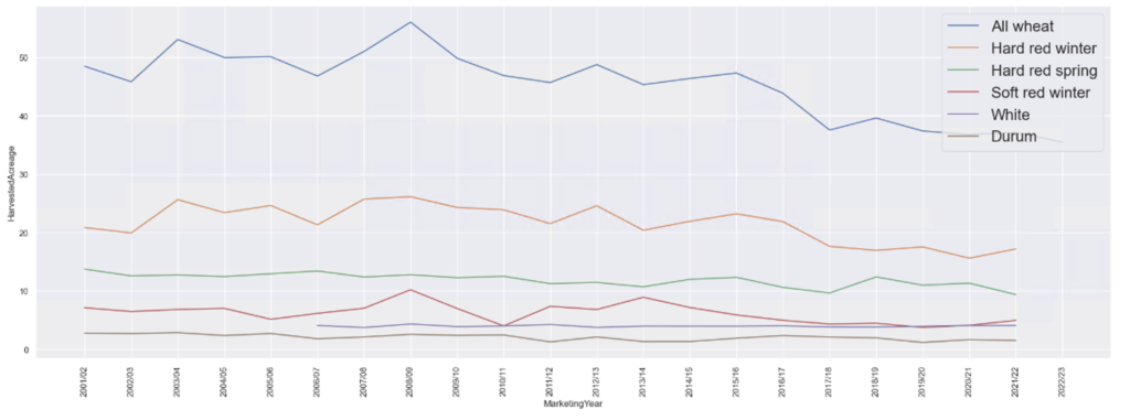
As you can see in the above plot, there is no data available for White variety of wheat before 2006/07 marketing year
Yield Visualization
Here is the plot for Yield, which is how much wheat is produced per unit area of plantation
wheat_raw_df['Yield']  = wheat_raw_df['Yield'].apply(lambda x: np.nan if str(x) == '--' else x)

for wheatType in wheat_raw_df['WheatType'].dropna().unique():
    print(wheatType)
    sns.set(rc={'figure.figsize':(25,8.27)})
    all_wheat_df = wheat_raw_df[(wheat_raw_df['WheatType']==wheatType) & (wheat_raw_df['Year']>2000)]
    gpg = sns.lineplot(data=all_wheat_df, x='MarketingYear',y='Yield',label=wheatType);
    gpg.legend(fontsize=20)
    plt.xticks(rotation=90);
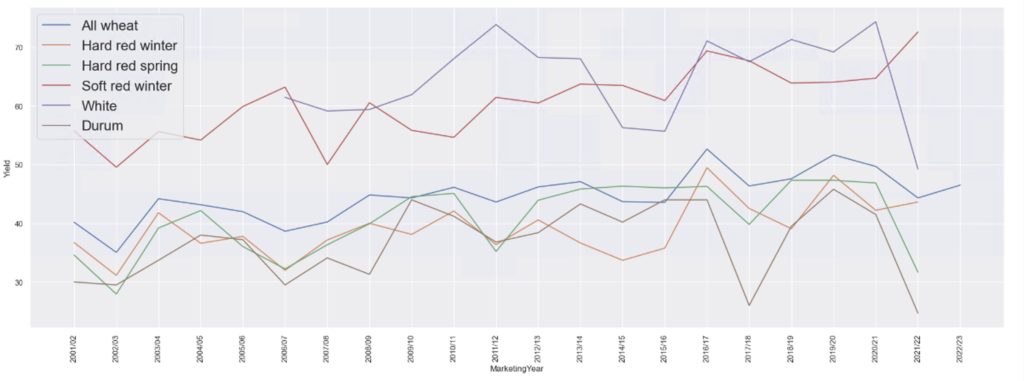
As you can see Soft red winter wheat has the highest yield by far over all other types of wheats.
I am leaving the step to visualize planted acreage for the readers as exercise
Complete Jupyter Notebook on Github
The full Jupyter notebook used in this article can be found on my Github page here.
Conclusion
In this article we analyzed the Wheat Production data for US from the dataset published by USDA. As we saw visualization can bring out certain trends and insights from the data very easily. Hence it is very important to learn data visualization as a data scientist. Hope this article was helpful in your journey towards learning Data Visualization in Python. I will continue to dig deeper into this dataset and keep updating this article as I go along.
Let me know if you any questions/suggestions in the comments below